Boosting Sales with Eye-Catching Food Packaging Design
In the highly competitive food market, your product only has a few seconds to make an impression that not only catches the eye but also convinces consumers to take a closer look, and ultimately, make a purchase. The power of captivating food packaging design cannot be overstressed, acting as a silent salesman for your product on the shelves.
Targeting a broad audience with a focus on maximizing sales and understanding how eye-catching packaging influences consumer behavior is essential. Here are key strategies and elements to consider when designing your food packaging to stand out and boost sales:
Understand Your Target Audience
When you make food packaging, you need to know who will want to buy your food. Think about what these people like and what grabs their attention. This helps make sure they pick your food from lots of choices.
Knowing your audience helps a lot in boosting sales. Make your package look nice and fun if kids are your main buyers or keep it simple and clear for older people. The goal is to make your food stand out, so more people want to buy it.
Color Psychology Matters
Colors are like feelings. They can make us happy, sad, hungry, or calm. When we see food packaging, the colors tell us a story about the food inside. Some colors can make us think the food is yummy and healthy. Other colors can make us think of fun or comfort.
The right mix of colors can help your food stand out. It’s like when you use bright colors, it can catch our eyes and make us want to see your food first. This visual impact is very important because it’s the first thing people see before they decide to buy.
Clarity and Simplicity
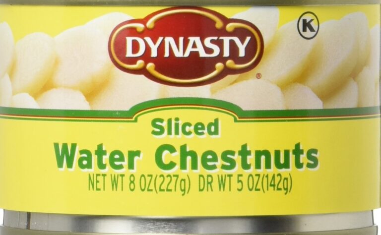
People like it when it’s easy to tell what they’re looking at. If they can quickly see what the food is and why it’s good, they are more likely to buy it. This is where being clear and simple comes in. The label design shouldn’t be too busy or have too much stuff on it.
Big, clear words and pictures that show off the food are best. If customers can look at the package and quickly know what they’re getting, they’ll be happier. This means more people will pick your food because they understand it fast.
Reflect Brand Identity
Reflecting your brand identity on your food packaging is like wearing a cool outfit so everyone knows who you are. Your brand is like your food’s personality. If people see your food on the shelves, they should be able to tell it’s yours because it looks and feels like what they know and love about your brand.
Like, if your brand is all about being fun and wild, use crazy colors and fun pictures. Or if your food is super healthy, make everything look clean and natural.
Functionality and Sustainability
When we talk about making your food package, it should be easy to use and good for the Earth. Functionality means your food package needs to work well. It should keep your food safe and fresh, and people should be able to open it and use it without trouble. Think about making a package that can be used many times or in different ways. This is really cool for customers.
Sustainability is about taking care of our planet. Use materials for your package that don’t hurt the Earth. This can be stuff that comes back to the Earth (like paper) or things you can use again (recycle). More people want to buy food that doesn’t make our Earth dirty. When your package is Earth-friendly, it tells people you care, and they like that.
Leverage Imagery and Graphics
Using cool pictures and drawings on your food package makes it super fun and can help your food get noticed. Big, clear pictures of the food or fun drawings can make someone want to pick it up and look. It’s like if they can almost see what they’re going to eat, they might want it more.
And, if your food is for kids, using cartoons or bright, fun stuff can make kids point and tell their parents they want it. For the grown-ups, nice pictures or cool designs can make them think the food is really good and special. This is a sneaky way to get everyone’s attention without saying a word.
Analyze Competitors
Looking at what other food makers are doing is like playing a spy game. You check out their food packages and see what colors, pictures, or words they use to make people want to buy their food. It’s important because you can learn what works and what doesn’t.
Maybe you see something really cool that you didn’t think of before and decide to try something like it for your food. Or you might find a way to do something even better. This helps your food to be the one people reach for first when they are shopping.
Prototyping and Testing
Making a mock-up, or a prototype, of your food package is like doing a practice run. It’s when you create a version of your package to see if it looks good and works right, but it’s not the final one. This step is super important because it helps you fix any problems before you make a lot of them.
After you make a prototype, you have to test it. Testing means you check if your package is easy to use, strong enough to keep the food safe, and looks nice. You can ask your friends or family to try using the package and tell you what they think. This helps you to make sure your package is the best it can be before you put your food in it and sell it to people.
Learn All About Food Packaging Design
Wrapping it all up and making your food packaging design awesome is super important. You have to know who wants your food, use cool colors and simple looks, show off your brand’s vibe, make it work well and not hurt the planet, add sweet pictures, check the other foodstuff out there, and test your pack idea to be sure it rocks.
Doing all this stuff makes your food jump off the shelf into people’s carts. Remember, your package is like the first hi-five between you and the buyer.
Did you find this article helpful? Check out the rest of our blog.


